Months and months went by and we all saw the maps. Generally shaded in five or six colors, shades of red, blue, and yellow or grey with new names, new notations and definitions. Strong Obama blue, weak Obama blue, strong McCain red, weak McCain pink and tossup yellow or undecided grey. New additions to the Crayola 64? Not likely, but someday soon may see Democratic blue and Republican red in crayon boxes throughout America’s elementary schools, simplifications of two colors that have become so associated with American political ideology and identity that the shift may be permanent.
Now that the election is over, so are the speculations and predictions of how the maps would shake out. There are no more tossups or battleground states. Instead, there are results. Maps are beautiful things, graphic representations of places too big to see with the naked eye. They are also distortions of reality. The old saying that warns about mistaking the map for the land is wise, but maps are excellent ways to compartmentalize information in a graphic way. Also, depending on how the information in the map is presented, wildly different conclusions can be made from one to the other.
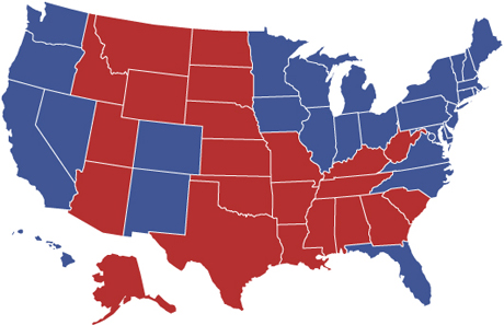
This first map represents the final tally of individual states’ results in the election. Blue represents the states won by Barack Obama on Tuesday, along with a circle representing the District of Columbia. Red are the states that John McCain took. This is the simplest of electoral maps, and shows nothing more than straight up or down votes on a statewide scale. There is little nuance in this map, but it is the most important, as it shows, when combined with information about available electoral college votes in each state, the final distribution of those votes, and the victor in the race.
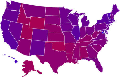
This next map has the nuance that the above map does not. In this map, the percentage of each candidate’s vote total was used to create a series of differing colors. For example, if Obama received 54% of the vote in a state as opposed to 46% for McCain, then that state was given a color that is a mix of 54% blue and 46% red. What we see instead of the stark lines drawn by the blue and red map, this purple map shows there was a distribution of votes between the candidates. Democratic voters live in Arizona and Tennessee, etc., and Republican voters live in Ohio and New York.
This map is very similar to one I made four years ago, as a response to the defeat of John Kerry in the election, and the interminable chorus from the right about ‘permanent Republican majorities’ and the division of America. This map serves to state quite clearly that we are still a whole nation, mingled in its beliefs and ideals. It’s a lesson I believe is important to remember.
This map does illustrate effectively where the most partisan voters reside, however, on a statewide basis. Just as it was four years ago, Washington D.C. is the bluest of the blue states, having given 93% of its vote to Barack Obama. Four years ago, Utah was the reddest state, and while it voted heavily for John McCain this year, Oklahoma takes the top prize as the reddest state in the union, giving McCain 66% of its vote. There is a huge difference between the support Obama received in the nation’s capital and the support McCain received in Oklahoma. It’s easy to dismiss this as an anomaly owing to the fact that Washington D.C. is not a state. But, it does have just as many residents as some of the large, rural western states, such as Alaska and Wyoming. Voting habits in Washington D.C. have little to do with its unique status is our country and everything to do with demographics. Washington D.C. is a big city, with a heavily minority population. Areas like this consistently vote for Democrats.
Of course, much of this information cannot be gleaned from this map. Instead, this image must be combined with what a person already knows about a particular area, or further detailed explanations that would accompany a map like this.
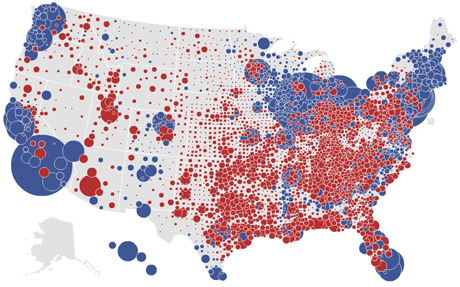
Some maps can be useful for gauging the spread of a candidate’s support on a more local level, and still distort the outcome. The map below is a U.S. county map with counties that voted for McCain in red, and counties that voted for Obama in blue.
To look at this map, without corresponding information about population density in the United States, one would think that McCain captured the vast majority of the country. Indeed, states that voted for McCain had a higher percentage of red counties than states that voted for Obama had blue. For example, California, a state that was never in doubt for Obama, had over two-dozen counties that McCain won, while Oklahoma had zero counties that went for Obama. In Ohio, a state Obama won, the vast majority of counties went for McCain. If the Electoral College had been based on the outcome of the race in individual counties, McCain would have won in a landslide. But, it isn’t, so he didn’t. More than anything, that’s an illustration of the fungible and arbitrary nature of the Electoral College, but that’s a subject for another day.

There are a few ways to present county-by-county outcomes in a more effective way. This next map was created by Mark Newman of the University of Michigan. It breaks down the county votes using a similar method to that which I used to create the purple state-by-state map. This map shows the distribution of votes on a percentage basis, but has the same failings as all of the maps above. Namely, it doesn’t account for the distribution of the country’s population. Newman solved this problem by creating cartograms, where the size of a county in the map is based on population, not area. All of Mr. Newman’s maps, in which he analyzes election returns on the state and local level, are available by clicking here.

The most elegant maps of the election results that I have seen so far were created by designers at the New York Times. This first map shows bubbles representing the counties in each state. The color of the bubbles represents the victor in each county. Red for McCain, blue for Obama. The size of the bubble is proportional to the amount each candidate is ahead. The large circles for Obama represent the huge vote totals he received in the nation’s urban areas. Not only did lots of people vote for him in the cities, he won by large margins.
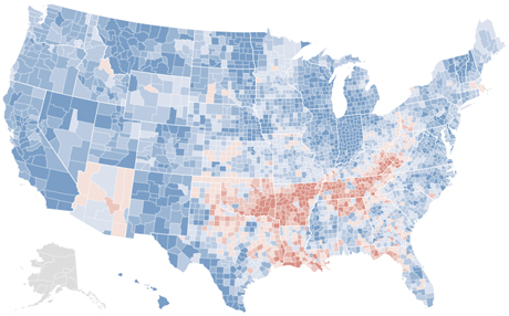
The last map is, I believe, the most revealing about the mood of the nation. Instead of basing the colors on the map on who won or lost each county, this map uses colors to denote the shift in voting patterns from the election four years ago. Counties that are blue voted more Democratic this year than they did four years ago. Counties that are red voted more Republican than they did four years ago. The richness of the color is proportional to the percentage gain in each county.
This map illustrates with succinctness the gains Obama made over John Kerry’s performance four years ago. Most of the counties in the United States voted more Democratic this year than four years ago. So while Republican majorities still exist in the wide tracts of rural America, this map makes an argument that the ground has shifted beneath the GOP.